Ryan Goodman has been in the business of data and analytics for 20 years as a practitioner, executive, and technology entrepreneur. Ryan recently created DataTools Pro after 4 years working in small business lending as VP of Analytics and BI. There he implanted an analytics strategy and competency center for modern data stack, data sciences and governance. From his recent experiences as a customer and now running DataTools Pro full time, Ryan writes regularly for Salesforce Ben and Pact on the topics of Salesforce, Snowflake, analytics and AI.
Over Thanksgiving break, I decided to mash up the classic data-geek debate of “Tableau vs Power BI” into an AI-powered rap battle. Three rounds of diss tracks with AI on the mic.
I’ve screened it with a few folks, and the reviews so far? Fun. Cringe. Silly. Freaking awesome.
Sometimes technology takes itself a little too seriously. This is meant to be silly, and a balanced showcase of where things stand. Not since the East Coast vs. West Coast battles of the ’90s have we seen such fierce loyalty between two groups of data sense-making professionals.
This week, I had a chance to update documentation and explore Salesforce External Client App configuration. There have been so many changes to Salesforce connected apps in terms of integration and commercial requirements. It is daunting for customers and partners.
What is Changing from Salesforce
3rd party tools that use the deprecated “Connected App” functionality will no longer gain the ability to connect to new Salesforce orgs in Spring 2026. Partners will need to upgrade, or get left behind. We are going to fork DataTools Pro app to no longer use Salesforce for federated access to DataTools Pro.
Integrated apps will need to join Salesforce App Exchange where fees are collected. This is going to cause a ton of friction and headache for vendors. DataTools Pro is already integrated into the AppExchange so this does not impact us.
What about Internal Built Apps?
This is an area that’s genuinely confusing and murky, so I decided to jump right into it by building our new customer and partner portal. It sets me up where Salesforce the system of record for customers, but events and activity related data are linked only by a single external UID.
The portal integrates with our support Slack, Salesforce, OpenAI, Stripe, and the DataTools Pro app. After running this experiment, it’s easy to see why Salesforce is scrambling to control and monetize the data within Salesforce.
When you build a portal / community in Salesforce, you are building for a point in time that has passed. We have opened up our portal for anyone to login via magic link to poke around and will rollout our new DataTools Shop in 2026!
We are moving to a more traditional federated login configuration with Google and Microsoft / Entra, and expanding our enterprise-specific SSO support.
Learn how to Setup Salesforce External Client Apps
If you are interested in the nitty gritty details of configuring Oauth for External Client APps, I have updated our Azure DataFactory tutorial to explain the process
Some our work followed me into Thanksgiving weekend, as I found myself playing with AI audio on Suno. One of the first outputs from my experiments is just a small taste of what we came up with.
The Data Song will tell you something, and absolutely nothing about data at the same time!.. It’s silly and the amuse bouche to what’s next!
Building Value, Delivering Success, and Learning from Failure
Aside from silly experiments, BI migrations with BIChart is picking a lot of steam headed into 2026. Before BIChart , I have seen multiple migrations crash and burn. Automating BI Migrations is tough work and there is a lot of it happening! The BIChart assessment is proving to be quite useful for clients, long before migration is finalized. Here is a November BIChart blog roll, including a recent case study:
Since we started DataTools Pro in late 2023, we created more than 20 tools to help us solve a number of simple, but painful problems. The first official DataTools Pro native app is available in the Snowflake marketplace. View and Install in Snowflake for free!.
Some thoughts on “AI Readiness” Buzzword
My perspective is “AI Readiness” is just “Readiness” for the next round of disruption we are all experiencing.
Being in a business / technology role for 20 years, I know that disruption is always on the horizon. Every facet of our human to computer experience is continuously improving. Companies like Cursor and Lovable have re-defined hyper growth, reaching $100M and $200M in revenue in their first year of operation. Both AI co-piloted tools are woven into my daily work. The barriers and friction to become a creator is the lowest ever, as demonstrated by my silly video.
How this Viewpoint Impacts Work
My personal experience using generative AI has been positive when my role is steering and course correcting. I have watched generative AI transform individual contributor productivity. However, that productivity plateaus quickly when moving beyond individual contributor into group work. The promise of autonomous agents requires continuous improvement and clear feedback loops from subject matter experts. This is the lens I look through while re-working Metrics Analyst for autonomous workloads and clear feedback loops.
Lovable Vibe Coding has captivated the market, enabling “vibe coders” with the ability to prototype and deploy apps in record time. With a full book of clients and workload, I found myself with an abundance of time fighting off a horrible cold for a week. I asked and posed the question… How long would it take me to build a fully functioning app with the following features:
User sign-up and authentication
Integration with 3rd party service: OpenAI
Control over mobile phone function (camera)
Secure with storage for upload
Account and subscription management
Payment management (Stripe)
Responsive, multi-device support (mobile and desktop)
Data export to CSV
Secure delivery optimized system emails
Solving a simple problem: Return Mail Rate Analysis
With no shortage of app ideas and prototypes, I decided to solve a very specific problem related to direct mail marketing: return mail management.
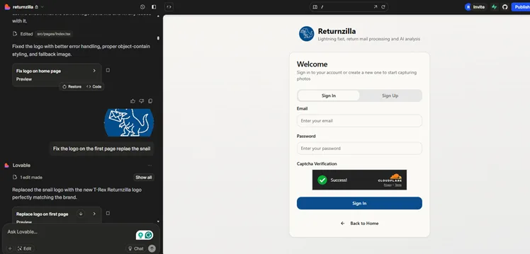
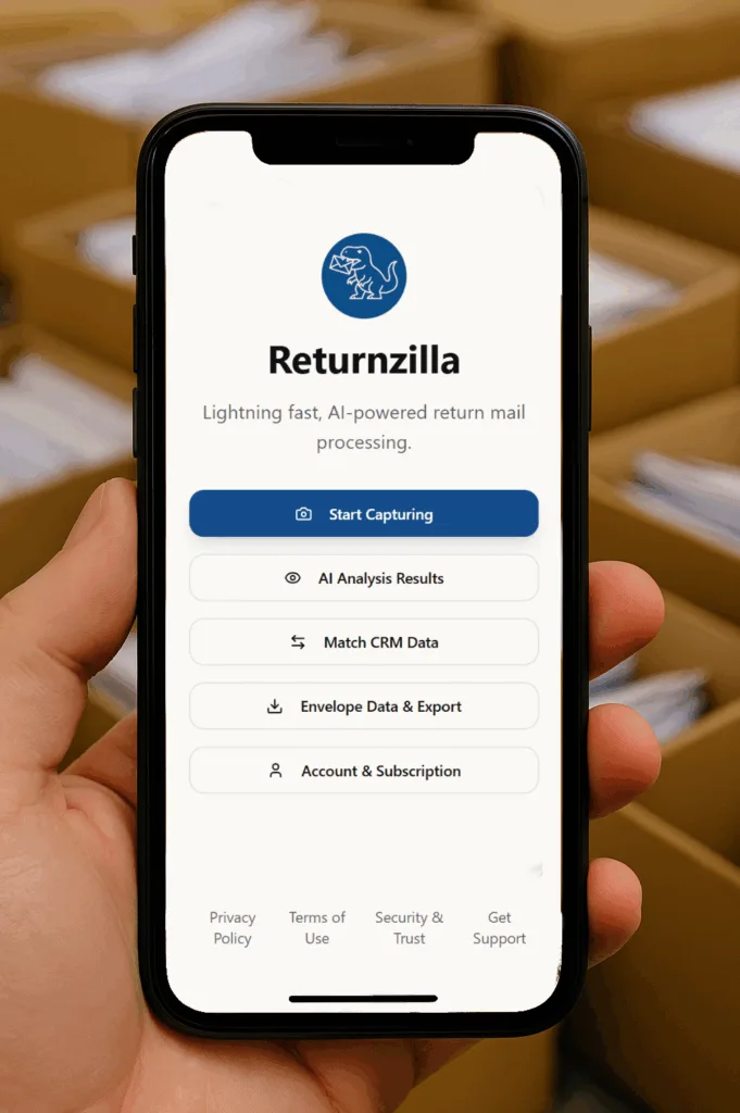
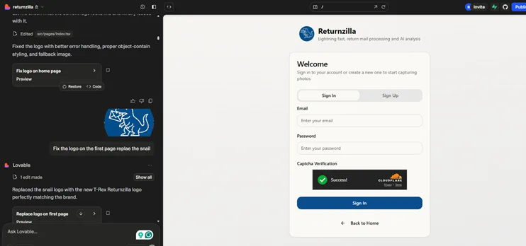
I decided to solve a simple analog problem. How can we quickly capture data from direct mail marketing returns? The solution to this problem was an expensive document scanner, data entry, or discarding the mail as a sunk cost. I built Returnzilla app, which allows anyone with a mobile phone to rapidly photograph the return mail. Those photos are batch converted into a data table using AI vision. That data is structured and prepared in the Returnzilla app for reporting return rates or integration into a suppression/enrichment list.
Working in 2 Hour Sprints
When I built this app, I was in bed sick, so I completed 80% of the work typing into the Lovable AI chatbot from my iPhone. In 6 hours over 2 days, I had a working app that I was sharing with friends and family. They helped me come up with the name Returnzilla!
Having a clear vision of outcomes and value is more important than knowing what features to build…
If you don’t know exactly what to build or how to solve the problem, you should not start in Lovable. Instead, you should start your journey with ChatGPT or Claude. Explain the problem you are solving, and what features you are considering to solve the problem. Have the LLM break down and plan features that will make the most sense. Copy and paste that information into Lovable and let AI take the first leap forward, prototyping your app.
Supabase is the unsung hero of Lovable Success
Lovable is a great front-end prototyping tool. To build an app, you need a database and middleware services to transact data to and from your database and third-party services. That is where Supabase comes in. The foundation for your app lives in Supabase:
Managed PostgreSQL Database: Supabase provides a fully managed PostgreSQL database, offering the power and flexibility of a relational database system with features like advanced data types, indexing, and full SQL support.
Authentication and User Management: It includes a comprehensive authentication system to securely handle user sign-ups, logins, and access control. It supports various methods like email/password, social logins (Google, GitHub, etc.), and multi-factor authentication.
Realtime Subscriptions: Supabase enables real-time data synchronization between the database and connected clients, allowing for instant updates in applications like chat or live dashboards.
File Storage: Supabase offers a secure and scalable file storage solution (built on S3 compatibility) for managing user-generated media like images, videos, and other files.
Edge Functions (Serverless): It allows developers to deploy and run serverless functions (written in TypeScript) globally at the edge, close to users, reducing latency and improving performance.
Lovable Vibe Coding Prototype vs Production
To deploy my app, I consulted an sr engineer to do a code review. Lovable and Supabase together accelerate a lot of the iterative work. As a result, the build process that took hours shaved weeks off my timeline. However, moving beyond a prototype is not as simple as publishing to the web. Even with a simple app like Returnzilla, I had to take some important steps to properly secure the app.
Lovable does provide security scans as part of the design and development process. If you have ever built an app, you know that scrubbing inputs, CSPs, and other basic app design best practices must be followed. For a basic website, like the one I built for GoodmanGroup LLC, there was not a lot of work needed to make it production-ready. The moment you start collecting data and adding gated content, it requires a login; the requirements to get to production change dramatically! I highly recommend seeking advice and oversight from an sr engineer before considering your app production-ready.
For DataTools Pro, I already have access to a number of paid services and previous work that I reused. Here is a basic list of configuration steps required to prepare for production.
Secure communication relay for email– I use SendGrid to handle my application emails.
Domain Routing andWeb Application Firewall (WAF) – I moved my app to the datatoolspro domain. Cloudflare is my DNS and proxy for all web apps.
Captcha – I use Cloudflare Turnstile to handle my captcha, which helps block bots from trying to sign up or attempting to overload my forms.
File Security – When I implemented file upload in Lovable, the default setting is to leave files wide open to the internet. If you do not have experience designing signed file access from a web app, you will need help from a developer.
Access to Device Camera – I set up Returnzilla to request access to the camera, but not the photo library. Error handling and mobile/desktop device handling took some time to test and validate, and required guidance for the AI that probably would have been easier to code.
Testing and QA
Lovable does an incredible job creating clean user experiences and connecting front-end, middleware, and backend. For this app, there are very few screens and workflows, so I was able to manually unit test and system test without fuss. Knowing your way around the browser console and logs is very helpful. A more complex app will require proper regression testing, system testing, and promotion management. I moved my Lovable work to a development branch and now promote through a versioning step in GITHub.
These standard software development lifecycle procedures are just one example where you may need to make a jump from “vibe coding” prototypes to a properly managed and maintained application.
One of the challenges and cautions I provide to anyone wanting to vibe code their way into production is to stick to very simple apps or use Lovable for what it does best…prototyping.
Bottom Line: I love Lovable + Supabase
I love any product that allows me to extend my knowledge and experience to get more done. This design pattern, using AI to rapidly prototype, has ushered in a new process for our work on DataTools Pro, where I want to increase throughput by 30% by the end of the quarter.
Vibe-coded micro-apps will change the way marketers think about microsites and lead magnets. Returnzilla, at it’s core, is a lead magnet to offer data services, identity reconciliation, and full funnel analytics. Now, I have a hook to go to a segment of marketing leaders who are doing direct mail. I will report back on how it works!
If you happen to do direct mail marketing, give Returnzilla a try. The first 50 scans are free!
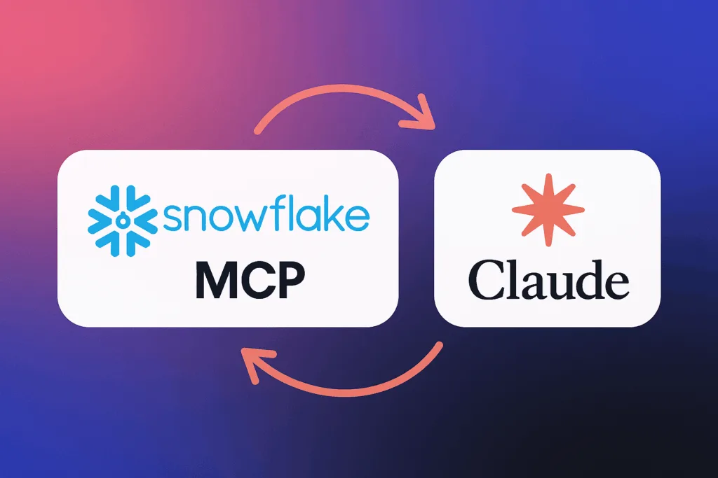
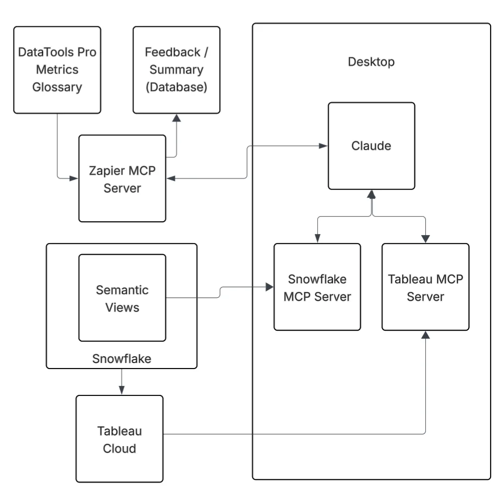
Last month, I had an opportunity to roll up my sleeves and start building analytics with Snowflake MCP and SnowflakeSemantic Views. I wanted to see how far I could push real-world analyst and quality assurance scenarios with Tableau MCP and DataTools Pro MCP integration. The results gave me a glimpse of the future of AI/BI with real, production data. My objective was to deliver a correct, viable analysis that otherwise would have been delivered via Tableau.
The time spent on modeling my data, providing crystal clear semantics, and using data with 0 ambiguity helps. My results delivered great results, but I ended the lab with serious concerns over governance, trust, and quality assurance layers. This article highlights my findings and links to step-by-step tutorials.
Connecting Claude, Snowflake MCP, and Semantic Views
The first step to connect all of the components was building my Snowflake Semantic views. Snowflake MCP gave me the framework to orchestrate queries and interactions, and using Snowflake Semantic Views gave me the lens to apply meaning. All of my work and experimentation occurred in Claude. This gave me the AI horsepower to analyze and summarize insights. To connect Snowflake to Claude, I used the official Snowflake MCP Server, which is installed on my desktop and configured in Claude.
Together, these tools created a working environment where I could ask questions, validate results, and build confidence in the answers I got back.
With my Snowflake Semantic View setup, I spent some time researching and reading other folks’ experiences on semantic views. I highly recommend having a validated and tested Semantic view before embarking on AI labs. If you don’t know what metadata to enter into your Semantic View, seek additional advice from subject matter experts. AI can fill in blanks, but it shouldn’t be trusted to invent meaning without human oversight: Why AI-Generated Meta-Data in Snowflake Semantic Views Can Be Dangerous
Bottom line… Begin with a simple and concise Snowflake semantic model. Build clearly defined dimensions and measures. Use real-world aliases and refrain from using AI to fill in the blanks, unless your objective. Layer on complexity once you’re comfortable with the results.
What Worked Well
Control over data access Thankfully, the Snowflake MCP is limited to semantic views and Cortex search. The opportunity and value of Cortex search cannot be understated. I will cover that in another post. The idea of unleashing an AI agent with elevated permissions to write SQL on your entire data warehouse is a governance nightmare. Semantic Views gave me the ability to scope exactly what Claude could see and query.
Accuracy of results The top questions I get during AI labs: “Is this information correct?” I had a validated Tableau dashboard on my other monitor to validate the correctness of every answer.
Simple to complex questioning My recommendation with any LLM-powered tool is to start with high-level aggregate questions. Use these to build a shared understanding and confidence. Then, grounded on validated facts, you can drill down into more detailed questions with confidence. This approach kept me in control when the analysis moved beyond existing knowledge and available analysis.
Where I Got Stuck
Three challenges slowed me down:
Metadata gaps – When the semantic layer lacked clarity, Claude produced ambiguous answers. It isn’t garbage in, garbage out problem…. It is me having a level of subject matter expertise that was not captured in my semantic layer or in a feedback loop to make the AI system smarter. LLM analysts feel less magical when you know the answers. That is where adding Tableau MCP allowed a pseudo peer review to occur.
Over-scoping – When I got greedy and exposed too many columns, ambiguity crept in. AI responses became less focused and harder to trust. Narrower scope = better accuracy.
Context Limits– I had Claude do a deep analysis dive. I also had it code a custom funnel dashboard that perfectly rendered a visual funnel with correct data. At some point, Claude explained that my context limit had been reached. My analysis hit a brick wall, and I had to start over. Claude is a general-purpose AI chatbot, but it was still disappointing to hit a stride and have to stop working.
Risks You Should Know
If you’re using AI to build your semantic layer, you need to be aware of the risks:
Do not give LLMs PII or Sensitive PII. As a rule of thumb, I do not add PII or sensitive PII into semantic models. I hope that at some point we can employ Snowflake aggregation rules or masking rules.
Governance blind spots. Connecting the Snowflake MCP requires access from your desktop. For governance, we use a personal access token for that specific Snowflake user’s account. That ensures all requests are auditable. Beyond a single user on a desktop, it’s unclear how to safely scale the MCP.
False confidence. Good syntax doesn’t equal good semantics. Always validate the answers against known results before you scale usage.
Final Take
Snowflake MCP and Semantic Views are still very much experimental features. They provide a glimpse of what will be possible when the barrier and access to governed, semantically correct data are removed.
In my case, I employed DataTools Pro for deeper metric glossary semantics and a writeback step via Zapier to capture learnings, re-directions, and insights for auditing purposes. If you would like assistance setting up a lab for testing, feel free to contact us to set up a complimentary session
I will never complain about having more metadata to improve visibility and understanding. Snowflake Semantic Views is an exciting development that our team jumped on to experiment with our client AI innovation labs. The whole purpose of building and governing semantics in your data warehouse and analytics platforms is to create meaning for the consumption of data.
Every enterprise approaches business analysis and requirements gathering for data engineering differently. At DataTools Pro, our entire business model centers on metrics governance and semantics. Our deep understanding of business drivers and outcomes is why we’re excited about the new Snowflake Semantic Views.
Unfortunately, we’ve also uncovered a major issue… It accelerates creation but could undermine long-term success and adoption of semantic views in Snowflake.
The problem: Using AI to automatically prepare and fill your semantic layer is a “use at your own risk” shortcut.
Why AI-Prepared Semantics Without Context Is Dangerous
If you don’t truly understand the meaning of the data in your Snowflake view, you shouldn’t rely on AI to generate the semantic model metadata.
AI tools like Snowflake Cortex can scan your data and infer semantics. This is dangerous because it creates a risk of distortion and misunderstanding for future users. The purpose of a semantic view is to apply clear, shared meaning to data, which helps with discovery, context, search, and analysis.
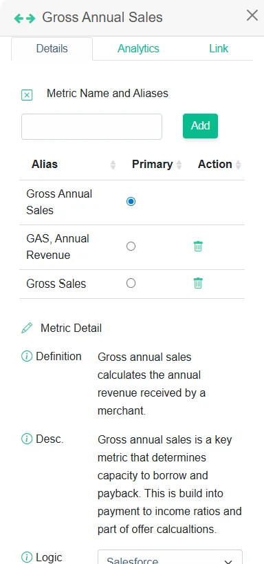
For example, imagine you run into a credit risk semantic view for business loan applications. Columns are labeled as:
AVG Sales
Monthly Gross Sales
Avg Balance
Annual Gross Sales
These are all distinct measurements with specific meanings and purposes to understand the financial stability of a client and the capacity for borrowing. Credit analysts rely on those differences for accurate analysis. If you let Cortex AI infer semantics and aliases here, you risk collapsing those distinctions, introducing confusion, and ultimately devaluing future AI tools that depend on your semantic view.
Lessons Learned Building Semantics and Metrics Glossaries at DataTools Pro
When we design a semantic view in Snowflake, we already have a metrics glossary for our clients taken directly from their loan origination system and credit-risk scorecard. We use AI less to infer meaning but rather to understand and infer disparity in existing semantics. Our learnings over the years is a key to a strong semantic model is not just labels. It’s the business definitions, descriptions, logical expressions, and taxonomy details that connect the dots for both business and AI consumers, along with a detailed plain English description without technology jargon.
This is why semantics must be curated by people who understand the business context. AI can help accelerate the process, but it cannot replace human interpretation of meaning
When we load and analyze data with Snowflake Semantic views using Snowflake MCP, we also load DataTools Pro metric glossary at the same time with Zapier.
Our Recommendations: Getting Started with Snowflake Semantic Views
Begin with a narrow, well-understood dataset. Choose data that already supports reporting and analytics so you can validate and build trust in the model.
Use AI for drafts, not for decisions. Let AI suggest aliases or descriptions, but then sit down with subject matter experts to review and fill in metadata manually. This highlights exactly how far off AI can be.
Expand where pain is high. Add new semantic views for topics and problems that cause outsized pain for business users. Even if they seem lower in strategic priority. These quick wins build adoption and credibility.
Bottom Line on Snowflake Semantic Views
Snowflake Semantic Views should be built with trust and meaning top of mind… not speed. Using AI alone to populate your semantic metadata is a shortcut that risks undermining the very purpose of the Snowflake Semantic view. Start small, work smart, validate with real analytics, and lean on your experts to build something amazing! If you need help, feel free to set up a free consultation.
Every enterprise struggles with the ‘multiple versions of truth’ problem. The anecdote where two people show up to an executive meeting with 2 different numbers for the same metric is a real problem. These meetings can get tense where semantics are argued instead of recommendations and actions. As someone responsible for data and analytics, I’ve felt the pain of these moments, especially when the source of confusion and solutions to resolve are simple. These are points where trust the information delivery pipeline (applications, data, analytics, information) are put in to question.
Enterprises with mature data and analytics practices still have these problems. Simple issues like mismatched timestamps, unclear filters, or inconsistent metric names can cause time wasting misunderstandings. Sometimes the root cause is competing reports or poorly aligned definitions. Other times, it’s just a lack of shared understanding.
This article explores the role of semantics in enterprise reporting and offers practical solutions to eliminate conflicting truths, starting with the simplest fixes while highlighting some of the lessons AI integrators can learn for the shortcomings of Business Intelligence.
Some multiple versions of truth problems are caused by semantics disconnect
Solving enterprise semantics problems with a data-first mindset is incredibly difficult. It’s like trying to solve a Rubik’s cube where the colors change constantly. There are plenty of smart folks out there taking a fresh look at this problem. I refer to this bottom up (data first) perspective where the objective function is connect data to meaning. This meaning helps describe how to manipulate data into a business consumable format that is to connect and theoretically reusable across analytical problems. I remain skeptical that building new data semantics layers without without process and functions for governance is creating the same problem in a new place; hoping for a different result.
Technology-centered perspective: For a long time, data and analytics platforms vendors have taken a self-centered view of the semantic layer. As a result, semantics are scattered and disjoined across self service reporting business applications, and now data platforms. There common variables across semantic layers are very thin and provide enough meaning for analysts and analytics professionals to create. The actual semantics and understanding of the semantic layer sadly is tribal knowledge or fragmented documentation. Universal semantic layers like At-Scale that could have the right solution at the right time.
My history and perspective:
Years ago, my time working at BusinessObjects taught me a lot about what works and doesn’t work with universal semantic layers. I have never had so much fun working in enterprise data and analytics during those days. I watched intense focus and high emphasis on governance and process to create a single source of truth. What happened? Service tools like Tableau, Qlik, and Power BI took off and what we consider today modern data platforms (cloud data warehouse) matured. These tools been transformational for me as a practitioner to get done in days what took months as I create re-usable models and blueprints.
Why Semantics Matter
Business semantics is the general corporate language or business vernacular used day to day. Ignoring all of the structures and technical jargon…. Terms like ‘customer,’ ‘revenue,’ and ‘activated’ are three common examples where meaning in a single organization can vary based purely on who, where, and what you are discussing. Semantics can be organized into a variety of structures for capturing meta data like semantic layers, taxonomies, glossaries and or embedded into more advanced frameworks like graphs and ontologies. You can walk into two different companies that compete in the same industry segment and experience different semantics.
Data/ analytics semantics aka “semantic layers” include the technical definitions, relationships, and rules that translate raw data into metrics, dimensions, and facts. This structured layer often defines how data is joined, filtered, aggregated, and labeled. This makes it possible for consistent reporting across BI tools and business functions. As the business intelligence function became decentralized and organizations purchased multiple tools, some enterprises struggle with multiple versions of truth purely as a function of disconnect between business semantics and semantic layers. A semantic layer that is not maintained and governed can produce incorrect results.
6 Simple Causes (That Have Nothing to Do with Your Semantic Layer)
The presence of semantic layers, even when executed flawlessly, will not always solve the multiple versions of truth problem. If you have 1 system of record, 1 semantic layer, 1 report… You can still end up with multiple versions of truth! Here are the common real-world instances that occur regularly with ultra simple solutions!
#1 Differing date/time dimensions: Example: Cohorts vs Activities.
Someone pulls a cohort-based metric into a report. A second person pulls the same metric from a historical trend for that metric. Both report the same period of time but the numbers are different! Both parties are correct, but reporting semantically different versions of what happened.
Solution: Improve the title and apply a detailed description and disclaimer in reports.
In data geek speak… A single metric can exist in one semantic layer, but when reported, it can be sliced by different time dimensions, which alters its semantic meaning. The problem and solution is proper explanation of semantic meaning when this information is delivered. You could have two metrics expressed in your semantic layer.
#2 Same numbers pulled at different point in time.
Same report pulled at different point in time. In this case both parties are correct.
Solution: Add an “as of” date clearly to every report or dashboard. I’m still surprised how often this simple step is skipped. I am guilty of it myself…
#3 Two flavors of same metric (from same self service report)
Someone views a metric through a different filter or lens, leading to two versions of the same number — without any context explaining how the data was filtered.
Solution: This is a scenario where data semantics maters and business semantics need to converge. In my approach with our metrics glossary we include context data that surrounds the use of a metric.
#4 Aliases and naming conventions
PowerPoint slide includes a key metric, but the name used on the slide doesn’t match the name used in the report. This disconnect can create unnecessary confusion or debate.
Solution: Sometimes it’s a case where the same metric has multiple names.. Other times, it’s just an error that wasn’t caught.
#5 Change management
Changes in the application, data, or analytics pipeline can introduce inconsistencies. When these changes are systemic or ongoing, you need to dig deeper to identify the root cause:
Limited team capacity or lack of training
Missing or ineffective governance processes
Gaps in software development lifecycle (SDLC) practices
Accumulated technical debt or platform bloat
Solution: Every customer has its own issues delivering consistent and reliable decision support. The root cases here in my experience is all over the board.
#6 Excel exports and manipulation
Data gets exported to Excel, where it’s often modified, transformed, or manually blended. It’s then presented alongside official reports, leading to inconsistencies that are difficult to trace.
Solution: Alignment and evaluating Excel logic is typically required to get to a solution.
These issues are a small sample of use cases I have captured to create process and tools to help address them. So what if the root of your problems and prescribed solution is creating a new semantic layer…?
Solve Multiple Versions of Truth with Semantics Layer Alignment
1: PEOPLE: Creating a semantic layer is the starting line and not the finish line
Teams need to find a way to close the gap between information consumers and the semantic layer creators. Rarely does a business consumer’s understanding of metrics start from the creation of a semantic layer. Newly created semantics and metrics that shed new light on the business process require even more alignment and care.
2. PROCESS: Semantic layer management done right is a governance process and NOT a technology requirement gathering process
Create a recurring governance process to align on the organization’s most important semantics, specifically metrics, KPIs, facts, and dimensions. Effective governance is not about tools or data for that matter.. It’s about structured conversations, shared understanding, and formalized communication pathways, and accountability.
3. TECH: Capturing when, how, why and where changes happen that distorts facts?
Use metadata tools, or catalogue tools with audit capabilities. Audit usage, monitor schema drift, and understand where facts get distorted. Technology alone won’t solve your problems, but it can shine a light on root causes.
4. AI: The hype is justified, but the reality is messy
Semantics of all types will remain a hot topic tech and service companies compete to become your go-to AI/ BI solution. The idea of having an in-house AI analyst, available 24×7 to answer business questions with data, is compelling. And to be fair, there’s a lot of real innovation happening in this space
I approach this constantly wanting to work my way out of a job. But based on my own testing, I’d describe today’s AI analysts as something that is technically capable, but operating as if it’s their seventh day on the job; and they’ve got a touch of amnesia.
That’s not a critique from the sidelines. I’ve loaded these models with structured data semantics, business context, report and dashboard metadata, usage logs, and conversational history. The confident insights and stats are magical. If feels less magical when you already know the correct answers.
So what happens when a business stakeholder walks into a meeting, proudly armed with insights from their new AI assistant, only to discover the output is way off? AI gets thrown under the bus.
How do you set yourself on the right path to create a useful and correct semantic layer with current technology solutions?
If you are a data or analytics professional getting started and wanting to implement a semantic layer and want to maximize adoption, I recommend the following advice:
Get out of the database and sit in on meetings where metrics are presented and debated.
Conduct a metrics governance alignment meetings between business stakeholders.
Put emphasis on standardizing and organizing curated reports for executive facing meetings.
Create internal naming conventions, tooltips, and glossary tags for reuse.
Have more advice or experiences that you want to share? Let me know!
More info on how I am solving semantics problems at DataTools Pro
In 2023, I set out to automate discovery, alignment, and change tracking for metrics and KPIs. The goal was simple: speed up onboarding and improve trust in metrics definitions. What we built, and continue to refine, is a metrics-first approach to semantic alignment. We released metrics analyst in early 2024 and have continued to refine in our vision. Shaped by customer feedback, failure, and iteration, we are releasing version 2 this summer!
I’m excited to solve at least one side of the Rubik’s Cube… even if the colors keep changing. Feel free to schedule a call to learn more!
Creating Hubspot cohort analytics is quite simple once you understand and prepare your funnel data properly. In this video, I decided to share in detail how I prepare data in Snowflake using Datameer. In this demo, I narrow in on the organic exploration and understanding of data that is lacking from many data and analytics solutions.
Implementing technology solutions that move and transform data is simple work
Moving data from Hubspot to Snowflake should require only a handful of clicks.
Connecting and joining Deals & Contacts to a Deals_Contacts in Snowflake should require a few lines of code.
Creating understanding and adoption of data assets intended for analytics & business outcomes is hard work
Creating understanding of data and desired outcomes across business and technical teams
Alignment of data “completeness and correctness” for data that is naturally imperfect
Delivery and adoption of data/analytic
Change management across systems, business definitions and teams.
Understanding and modeling data to fit a desired outcome is where the real work begins and why I am so bullish on Snowflake + Datameer.
In today’s video, we dive into the technical details and process how we use Datameer to explore, transform and publish HubSpot cohort analytics data directly inside of Snowflake.
Hubspot Cohort analytics in Snowflake video:
How to handle junction tables between contacts and deals
How to filter and reduce raw data into business-ready tables
How to visually explore and validate record matches
How to deploy clean, validated data sets as Snowflake views or tables
Change management, source control, and promotion management
Whether you’re building cohort analyses, revenue attribution, or funnel-to-ERP connections, this is how we go from messy CRM data to clean, trusted insights.
Need help building Hubspot analytics or setting up Snowflake
Many businesses are embarking on a Snowflake migration. Snowflake is a powerful data warehouse that has expanded its reach as a full blown data platform. Snowflake data quality problems can arise during migration if the processes beyind your data platform are not carefully connsidered.
.. Big moves, there’s always the risk of running into challenges, especially concerning data loss. When data doesn’t transition as expected, it can disrupt operations, leading to potential setbacks. Safeguarding your data during a migration isn’t just about avoiding mishaps it’s about ensuring business continuity and maintaining data integrity. Without proper precautions, you risk losing valuable information, which could impact decision-making and lead to setbacks.
In recent months Snowflake introduced Snowconvert AI. You can use SnowConvert AI to quickly migrate from legacy platforms like Oracle, SQL Server, or Teradata into Snowflake. This service will translate your existing SQL into Snowflake-native SQL. This saves a tedious and manual step and leans on Snowflake’s vast resources to help you stop wrestling with old tech and start taking advantage of everything Snowflake has to offer.
Currently, Snowconvert is available for the following source platforms:
The first step in preventing data loss is evaluating your data before the migration process begins. By doing a comprehensive assessment, you’re not just understanding what you’re moving; you’re also getting a grasp on its quality and relevance. Think of it like packing for a big move. Before you move, it’s always wise to sort through your belongings, deciding what to keep, donate, or toss out. In a similar way, data evaluation lets businesses filter through what’s useful and what’s redundant.
Here are some steps to aid in this evaluation:
– Identify Critical Data: Determine which data sets are crucial for your operations and prioritize them during migration.
– Identify Sensitive: Determine any data sources or tables containing sensitive or highly sensitive data that would fall under both regulatory, legal, or internal governance policies.
– Data Accuracy and Quality Processes: Presumably your enterprise data team has processes in place to certify the accuracy and integrity of your data. Those processes will need to move along with data itself. A data migration is a wrong time to run a data quality initiative because you end up with conflicting priorities and severely high risks for delays that will block your final delivery and cutover.
–Review ETL and Application Connectivity: Inventorying all processes pushing and pulling data from your data platform is pivotal to governing your data and controlling costs. Hidden behind the curtains could be processes that continuously run against your legacy platform to simulate “real time.”
– Data Inventory / Archival: The cost of storage could plummet when you move to Snowflake vs other solutions, but you still should consider outdated or irrelevant data that no longer serves a purpose. This not only lightens the migration load but also improves the quality of your database.
Extend your Backup and Disaster Strategy
Protecting your data doesn’t stop at just evaluating and organizing it. One of the most effective ways to guard against data loss during a Snowflake migration is by establishing solid backup strategies. Backups serve as your safety net, ensuring that you have a fallback option if something goes wrong during the migration.
Consider Snowflake RBS (role based security) from your Legacy Security Model
One area that can cause hang-ups and delays in a data migration is a security model change. Legacy systems can have multiple generations of security, migrations, and that needs to be reconciled to ensure you adhere to security standards that govern principles of least privilege.
Get Data Analysts Involved Early and Often
A left and shift for your existing data platform to Snowflake may or may not render tools and code obsolete. Luckily many popular data and analytics tools you already use connect to Snowflake. There are however several purposely built platforms that make working with data in Snowflake much easier.
Monitoring and Verifying Data Post-Migration
Once your migration to Snowflake is complete, continuous monitoring and verification processes ensure your data’s integrity. Think of this as the post-move check—making sure everything is in its place and nothing’s missing.
Key steps include:
– Data Health Checks: Regularly verify data accuracy and consistency. This helps identify any discrepancies early.
– Automated Alerts: Set up notifications for unusual activity or errors. These alerts serve as an early warning system for potential issues.
– Routine Data Audits: Conduct audits to confirm that your data remains clean and well-organized. This ongoing care keeps systems efficient and reliable.
You can feel confident about your Snowflake migration’s success through diligent monitoring and verification. Your data remains secure and accurate, ready to meet the demands of your business.
Safeguard Your Data During Snowflake Migration
Data migration to Snowflake offers immense advantages, yet it also comes with its complexities like any data platform. Embarking on a successful Snowflake migration a key step in modernizing your data infrastructure, and DataTools Pro is here to support every stage of your journey. Leverage our robust tools and strategies to ensure your data remains secure and transitions smoothly.